Turning Ideas
into
Communications
Turning Ideas
|
 |
Brochures Need To Be... |
|
|
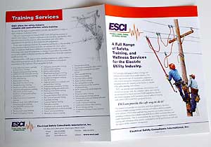
... tailored to the response desired by the client.Brochures must be designed to be attractive to their intended target audience. There are times when this means using a simple graphic layout that is easy to read and understand. In other instances, the best approach is one which captures the attention of the reader so much that they can't resist reading. These days, your print brochure can be used to develop a website look, or visa versa. |
|
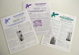
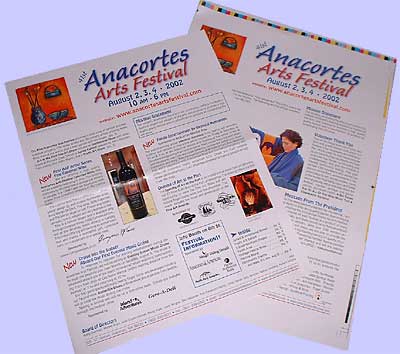
This brochure is sent out to artists who may wish to be in this regional art festival. For several years we produced two-color pieces, but since 2002 we have produced four-color layouts for them. |
|
 |
 |
 |
How can we be of assistance to you? Contact us by pressing the button... Please!
|